Choosing the right color palette for your business card is essential in communicating the right message about your brand. Colors evoke emotions and have a psychological impact on people, which is why selecting the right hues can play a significant role in creating a lasting impression.
Why Color Matters
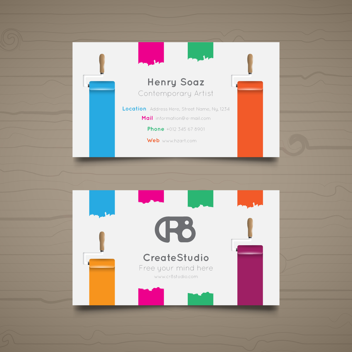
The colors you use on your business card can say a lot about your company and your values. For instance, blue often symbolizes trust and professionalism, while red represents energy and excitement. A well-thought-out color palette not only reinforces your brand identity but also makes your card stand out in a sea of competitors. Here’s how to choose the best colors for your business card:
1. Understand the Psychology of Colors
Colors are not just aesthetically pleasing – they influence how we feel and how we perceive a brand. Here’s a quick breakdown of what certain colors represent:
- Blue – Trust, reliability, professionalism
- Red – Passion, energy, urgency
- Green – Growth, health, tranquility
- Yellow – Optimism, creativity, happiness
- Black – Sophistication, luxury, authority
- White – Simplicity, clarity, cleanliness
- Purple – Creativity, uniqueness, luxury
Choosing the right color can help communicate the values of your business and leave a lasting impression on potential clients.
2. Keep It Simple
When choosing colors, it’s important not to overwhelm your business card design. Limit your palette to two or three primary colors to maintain visual harmony. You can use one color for the background and another for the text, with accents in a complementary shade. Simplicity is key to ensuring your card looks clean and professional.
3. Align Colors with Your Brand Identity
Your business card should reflect your brand’s identity. If your brand uses a specific color scheme across your website, social media, and marketing materials, ensure that your business card follows suit. Consistency in color creates a strong, cohesive brand image that makes your business easily recognizable.
4. Consider the Industry and Audience
Your choice of color can also depend on the industry you’re in and the type of clients you serve. For example, a creative agency might opt for vibrant, bold colors to reflect their creativity, while a law firm might stick to classic, more neutral tones like navy, gray, and black to convey professionalism and authority.
5. Contrast for Readability
While color is important, readability should always be a priority. Ensure that there’s enough contrast between the text and the background to make the information easy to read. Dark text on a light background is generally a safe bet for clarity, but you can experiment with different combinations to see what works best for your card.
Conclusion: Choose Wisely, Design Boldly
The colors on your business card are an important extension of your brand. By choosing the right color palette, you can communicate your brand values, make a strong first impression, and ensure that your card stands out. At FastAppBox, we specialize in creating business card designs that not only look great but also reflect your brand’s identity. Let us help you choose the perfect colors for your card and leave a lasting impression.